- June 1, 2021
- Posted by: justdebsevents
- Category: Events
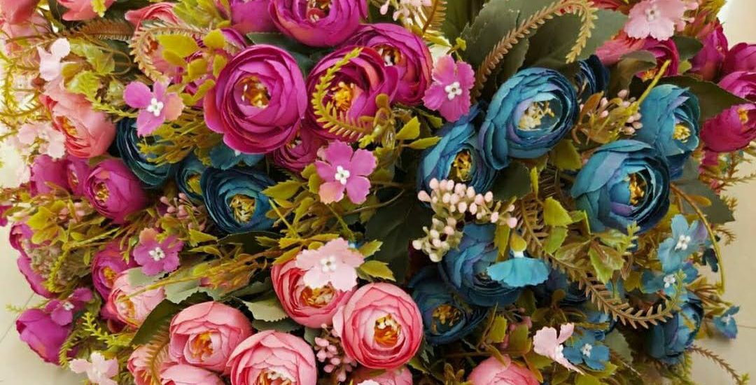
Secrets to floral designs can never be overemphasized. Basic rule in floral arrangements
There are seven main principles of floral design: proportion, scale, harmony, rhythm, balance, unity and emphasis. When these basic flower arranging rules are understood and used correctly you can create gorgeous floral arrangements.
What are the 6 principles of floral design?
Size: In Floral Design, size is a visual dimension of a component, rather than the actual dimension.
The six Principles of Design are:
Balance, Contrast, Dominance, Proportion, Scale and Rhythm.
Principles and Elements of Design
Flower Arranging is the art of organizing the design elements of plant material and other components according to artistic principles to achieve beauty, harmony, distinction, and expression. The terms flower arrangement, design or composition are synonymous. Components used in creating a design are plant material, container, background and mechanics. Optional components that may be added to the design include accessories, featured objects, and bases. The principles and elements of design guide arrangers in creating and judges in analyzing flower arrangements. It is imperative that all flower arrangement judges be thoroughly familiar with these concepts.
Principles of Design
Balance, dominance, contrast, rhythm, proportion and scale are the basic standards used to organize the design elements and an arrangement is judged on how well these principles are applied.
- Balance is visual stability achieved by placing equal visual or actual weight on opposite sides of an imaginary central axis. a. Symmetrical balance is achieved by placing equal amounts of similar materials on either side of a central axis. b. Asymmetrical balance is balance without symmetry achieved by placing approximate equal visual weight of different elements on each side of a central axis.
- Dominance is control of a design by one or more of the elements. It implies the presence of primary and subordinate elements within the design.
- Contrast is the use of opposite or unlike elements to emphasize differences and add interest.
- Rhythm is a dominant visual path through a design. It is achieved by the use of gradation and repetition in a linear direction.
- Proportion is the relationship of one area of a floral design to other areas of the design and to the design as a whole.
- Scale is the size relationship of the individual component parts of a design to one another and the size relationship of the arrangement to the surrounding area.
Elements of Design
Light, space, line, form, size, pattern, texture and color are the visual qualities used in creating a design and are common to all art forms. An arrangement is judged on the effective use of these elements.
- Light: Illumination (natural or artificial) is necessary for vision. It affects color, shadows, and the visibility of a design.
- Space: The open area in and around the arrangement. It includes the space in which the design is placed
- Line: A visual path that leads the eye through the design and establishes the structural framework of the design. It carries the rhythm through the design.
- Form: The contour of two-and three-dimensional material. It applies to individual components within the design as well as the contour of the design as a whole.
- Size: The visual dimension of line, shape, form and space.
- Pattern: The visual quality created by a combination of lines, forms, colors, textures and spaces in the design. It is dependent on illumination.
- Texture: The visual surface quality of the components, e.g. rough vs. smooth, dull vs. shiny.
- Color: The visual response of the eye to light waves. There is a corresponding relationship between the principles of design and color. Warm colors (yellow, red, orange) seem to move forward. Cool colors (blue, green, violet) recede and seem farther away. An area of cool color will seem smaller than an equal area of warm color. The qualities of color are:
- Hue or Chroma: The specific name of a color such as red, green, etc.
- Value: The lightness or darkness of a color. Pink is a light value of red obtained by adding white. It is called a tint. Maroon is a dark value of red obtained by adding black and it is called a shade.
- Intensity: The brilliance or dullness
Color Terms
Primary Colors: Red (carmine), yellow and blue (phthalocyanine) from which all other colors may be mixed.
Secondary Colors: Orange, green and purple, made by mixing adjacent primary colors on the color wheel.
Tertiary Colors: Colors located between primary and secondary colors on the color wheel, created by mixing any adjacent primary and secondary color.
Hue: The clearest form of any color, without the addition of black, white or its complement.
Chroma: The intensity, strength or saturation of a color. The intensity of a hue can be reduced by its complementary. For instance, the intensity of green can be reduced by adding red — the eventual result being a neutral gray.
Value: The lightness or darkness of a color, e.g. light or dark blue.
Shade: A color darkened by adding black.
Tint: A color lightened by adding white.
Complementary Color: Colors opposite each other on the color wheel. Mixing complementary colors will produce gray.
Monochromatic: A color scheme using values of only one color. Sepia (reddish-brown) is a common choice in illustration.
Analogous: A scheme using two or three adjacent colors on the color wheel. Example: yellow, yellow-green, green or blue, purple, violet. This scheme is equally useful in creating a simple palette for an illustration or a garden design.
Warm colors: Generally thought of as yellow, orange and red, which seem to advance toward the viewer. However this distinction may also be made of blues and greens. Example: ultramarine blue is ‘warmer’ than cobalt blue. Willow green is ‘warmer’ than sage and Cadmium red is ‘warmer’ than carmine.
Cool Colors: Generally, blues, greens and violets, which appear to recede
Oasis® invented a green sponge like material shaped as a brick that holds water.
What are alternatives to floral foam?
- Chicken Wire.
- Flower .
- Gravel rocks and pebbles.
- Willow, rattan or pliable reeds.
- Wood Wool.
- Water vials.
- Flower
Secrets for Mastering the Art of Flower Arrangements
People love stunning floral decorations. Some decorations catch the imaginations of some creative folks and they strive to pull off such decorations on their own. Deep down, they appreciate the craft of floral decorations and want to learn more. In this blog post, we will discuss 10 secrets that can help anyone master the art of flower arrangement while creating decorations that can last longer.
1) Use Water to Preserve Them
Putting flowers in water as soon as you bring them home can prolong their freshness for a long time. Before adding flowers in the vase, put some lukewarm water and add some preservatives.
2) Trim
You can easily give your floral arrangement a professional touch with a simple trim. Get rid of extra stems and leaves hanging below the water line before arranging flowers in the decorative pattern.
3) Use Warm Water for Full Bloom
Flowers such as rose and buttercups often don’t bloom to their fullest. As a result, they go on to exhibit dullness in the decoration as well. To ensure that flower heads open fully, one should leave their stems in lukewarm water for a day or two.
4) Use Florist’s Foam
In order to preserve flowers in decorations for a long time, use florist’s foams. Soak it in water for a couple of minutes and then fit in the decoration container. This simple arrangement can extend the freshness of floral decoration by many days. Don’t forget to water the foam once in a while.
5) Cut a Bit of the Stem
Many times people bring flowers but they sag and lose their gleam even before becoming part of the decoration. To avoid this, cut an inch or half of the stem and get rid of its blunt end. With a sharp fresh cut, the stem will have better water absorption.
6) Set the Large Flowers First
While arranging a floral decoration, always make the foundation with large flowers and add small ones in the available space. This arrangement will allow for every flower to create its unique presence.
7) Focus on Monochromatic Arrangements
Stacking flowers of various colors together don’t always look the way you want them to. Instead, use flowers with different contrast of the same color in a single arrangement. Such floral arrangement is easy to pull off.
8) Keep the Arrangement Tall
While setting the bunch of flowers in an arrangement, make sure that their overall length remains longer than the decoration container.
9) Make the Most of Leaves and Stems
Flowers are undoubtedly the centerpiece of any floral decoration. But don’t forget that the right filling of stems and leaves is equally important for floral arrangements, particularly the ones with larger spans. Use stems and leaves in the remaining spaces and also outline the container and other adjoining facades with them.
10) Keep the Heat Away
Remember that cut flowers don’t require sunlight. Heat is also good for them. So, keep them away from sun and heating vents for prolonged freshness.
By taking care of flower decorations through these secrets, you can handle flowers with florist-like expertise.
At JUSTDEBS EVENTS, floral designs are always one of our ways of making events spectacular .
www.justdebsevents.com